Photographer Booking Page Example That Converts
See a photographer booking page example that turns interest into paid sessions with clearer pricing, deposits, reminders, and less back-and-forth.
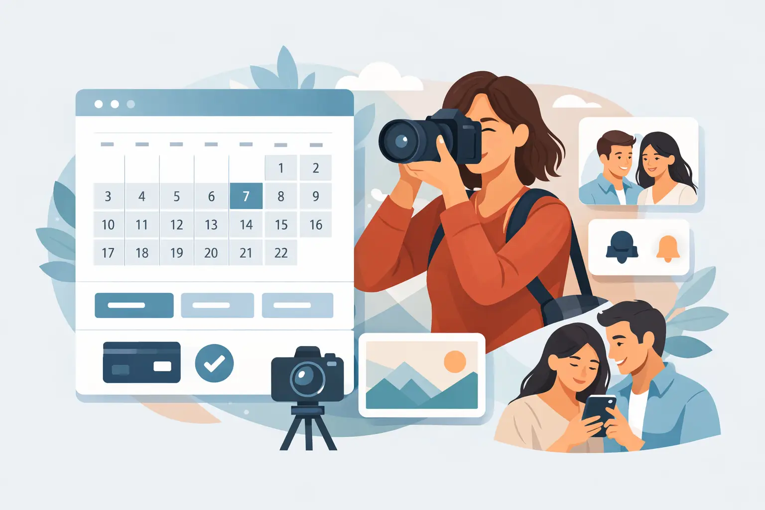
A client lands on your booking page ready to book, then pauses. The pricing is vague, the session options are unclear, and there is no next step that feels certain. That is usually where a sale slips. A strong photographer booking page example is not just attractive - it removes doubt, sets expectations, and makes payment feel like the natural next step.
For photographers, the booking page does a job that used to happen over three or four messages. It explains the offer, answers common questions, collects the right details, and confirms the client is serious. If any part feels confusing, clients delay. If it feels polished and direct, more of them book.
What a photographer booking page example should actually do
The best booking pages are not built around design trends. They are built around decisions. A client should be able to understand what you offer, choose the right session, see the cost, pay a deposit if required, and leave knowing what happens next.
That sounds simple, but many photography booking pages miss one of those steps. Some hide pricing to start a conversation. That can work for high-ticket custom work, but it often creates extra admin for family sessions, portraits, mini sessions, or seasonal bookings. Others show pricing but skip the deposit, which means the calendar fills with tentative bookings that are easy to cancel.
A useful standard is this: your booking page should reduce back-and-forth, not create more of it. If a client still has to email you to ask what is included, how long the session lasts, whether the time is confirmed, or how to pay, the page is not finished.
A practical photographer booking page example
Imagine a portrait photographer offering three session types: headshots, family sessions, and mini sessions. The booking page opens with a clear headline that matches what the client came for, followed by a short line that explains the experience. Not a paragraph about artistic philosophy. Just enough to reassure the client they are in the right place.
The next section shows session choices in plain language. A headshot session might say 30 minutes, one location, online gallery, and starting price. A family session might say 60 minutes, up to six people, outdoor location, and gallery delivery timeline. A mini session might clearly state that dates are limited and require full payment or a deposit to reserve.
After the client chooses a session, the page shows available times. Then it asks for only the information needed to complete the booking - name, email, phone, and one or two details relevant to the shoot. This is not the place for a long intake form. If the booking form feels like homework, conversion drops.
At checkout, the client sees the deposit amount, cancellation terms, and what happens after payment. They pay, receive confirmation, and get an automated reminder closer to the session date. That flow feels professional because it is specific. It respects the client’s time and protects the photographer’s calendar.
Why this kind of page converts better
A booking page converts when it answers the client’s silent questions in the right order. First, is this the right service for me? Second, how much does it cost? Third, what do I need to do now? Fourth, can I trust this process?
That is why clarity matters more than clever copy. A polished page does not need to say much, but every line should reduce uncertainty. Even small choices make a difference. Writing “Reserve your session with a $75 deposit” is stronger than “Contact me to get started.” One creates a next step. The other creates work.
There is also a business benefit beyond conversion. A page that collects deposits and sends reminders helps reduce no-shows and soft cancellations. For photographers selling time, that matters as much as lead generation. An unprotected slot is not just an inconvenience. It is lost revenue and a harder week to rebuild.
The elements every photographer booking page example should include
A strong page usually includes the same core pieces, even if the style varies.
First, session names should be obvious. Avoid internal package names that mean something to you but not to clients. “Signature Story Session” may sound premium, but “60-Minute Family Session” is easier to understand.
Second, include pricing or at least a clear starting price when the service is standardized. If you offer custom wedding or brand photography, it may make sense to lead with an inquiry instead of instant booking. But for fixed offers, hidden pricing often slows down decision-making.
Third, explain what is included in simple terms. Duration, location, number of people, image delivery, and turnaround expectations all help clients book with confidence.
Fourth, make the deposit visible before checkout. Surprising clients with a required payment at the final step can create friction. If a deposit is part of your policy, present it early as part of the booking process.
Fifth, confirm the next step after payment. Clients should know whether they will get a confirmation email, prep instructions, reminder messages, or a follow-up questionnaire.
None of this is flashy. That is the point. Booking pages work best when they feel easy to trust.
Common mistakes in photographer booking pages
The most common problem is trying to do too much on one page. A booking page is not your full portfolio, your brand story, and your FAQ center all at once. Clients who are booking are already near a decision. They do not need a long scroll filled with every testimonial and every service variation you have ever offered.
Another issue is weak package structure. If the difference between your sessions is unclear, clients stall. A good rule is that each session type should be easy to choose based on time, purpose, or deliverables.
Some photographers also ask for too much information upfront. You may want to know outfit plans, exact shot lists, location preferences, and backup dates, but those details can often wait until after the booking is confirmed. Early friction costs more bookings than it saves in prep.
Then there is the no-deposit problem. Not every business needs a deposit on every service, but photographers often benefit from one because the appointment is tied directly to limited time slots. A smaller upfront payment can be enough to create commitment without making the booking feel heavy.
How to adapt a photographer booking page example to your business
The right structure depends on what you sell. A mini session page should feel fast, direct, and time-sensitive. A portrait session page may need a little more explanation. A custom branding shoot may start with an inquiry and then move into a booked consultation.
That is where trade-offs matter. Instant booking works well when your service, timeline, and pricing are standardized. If every project is different, you may still want a booking page for consultations rather than full sessions. The goal is not to force every offer into the same funnel. The goal is to make the next step clear enough that serious clients keep moving.
For solo photographers and small teams, simpler is usually better. A clean booking flow with session selection, deposit collection, and reminders often performs better than a bloated system packed with options clients do not need. That is one reason platforms like Revenue Studio appeal to appointment-based businesses - they focus on getting the booking confirmed and paid without adding extra operational weight.
What clients notice, even if they do not say it
Clients notice when your booking page feels organized. They notice when the payment step is clear, when the session options make sense, and when confirmation arrives right away. They also notice the opposite. If the page feels unfinished, they start wondering whether the rest of the experience will feel the same.
That does not mean your page needs luxury branding or complex customization. Premium often looks like restraint. Clear pricing, clean session options, a visible deposit, and timely reminders create a better impression than a crowded page trying to prove too much.
The useful benchmark is not whether your page looks impressive to other photographers. It is whether a client can move from interest to commitment without hesitation. If they can, your booking page is doing its job.
A good photographer booking page example is not really about layout. It is about confidence. When the page makes decisions easy, clients book faster, your schedule is better protected, and the whole business feels easier to run.